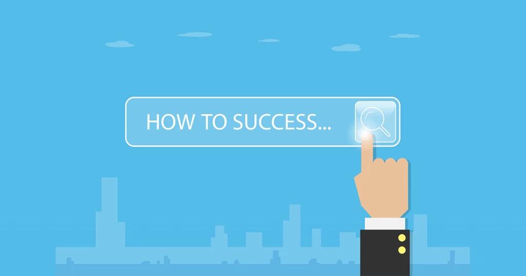
A CTA button is a button on a website designed to encourage users to click and guide them toward taking an action (conversion).
By presenting it in a button format that stands out visually, you can encourage users to take action. To use CTA buttons effectively, it is useful to apply techniques related to text, color schemes, placement, and similar elements.
This article introduces key points to keep in mind when creating CTA buttons, techniques for designing effective CTA buttons, and ways of thinking that help turn them into measurable results.
Table of Contents
Fundamentals of CTA Buttons
First, as basic knowledge about CTA buttons, we will explain what CTAs are, provide an overview of CTA buttons, and describe their role.
What is a CTA?
CTA is an abbreviation for “Call To Action,” and on a website it refers to elements that guide visitors to the intended page and prompt them to take some kind of action. Such actions include, for example, the following:
- Request for information
- Purchase
- Member Registration
CTAs are classified into two types: those that contribute directly to sales are called “primary CTAs,” and those that promote brand awareness and affinity are called “secondary CTAs.”
In any case, the essential purpose of a CTA is to clearly communicate the benefits and appeal of taking action, and to guide users toward conversion.
Characteristics of CTA Buttons
A CTA button is a button on a website designed to encourage users to click and lead them to take an action (conversion).
For example, on a landing page (LP), this refers to buttons that allow users to purchase a product or request materials. In addition, there are various types of CTAs depending on the objective, such as elements that direct readers from a column article to a landing page or guide them to other content.
When you want users to take a specific action, simply guiding them with text alone has limited impact. In contrast, a CTA button is a clickable button format, making it more visually compelling and more effective at prompting users to act.
By making effective use of CTA buttons, you can improve your conversion rate.
If you would like to learn more about LPs, please refer to this article:
https://botchan.chat/base/lpcvr-improve2
Why it is necessary to optimize CTA buttons
There are two main reasons why CTA buttons should be given priority.
First, it is to generate conversions.
CTA buttons serve to make the pathways on a website more prominent so that users are more likely to complete conversions, such as purchasing a product or requesting materials.
In short, to improve the conversion rate, it is important to design and use CTA buttons effectively.
Next, it is to prevent users from dropping off.
It is important not only to drive conversions such as purchases of the products introduced earlier or requests for materials, but also to place CTA buttons that lead users to inquiries or more detailed information.
By placing user-oriented navigation paths and CTA buttons that match the information users are seeking, you can improve conversions.
If you would like to learn more about CVR, please see the following article:
https://botchan.chat/base/cvr2
Microcopy and Labeling
When creating a CTA button, microcopy and labeling are crucial.
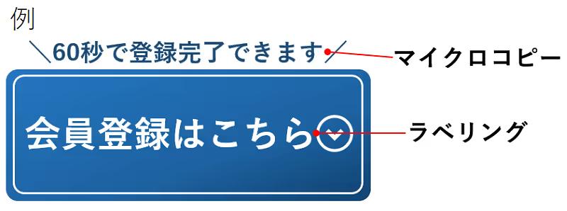
As shown in the image above, the text written on the CTA button is called the label, and the text placed near the CTA button is called the microcopy.
The wording of CTA button labels and microcopy can significantly affect click-through rates, so let’s refine them to create more effective CTA buttons.
10 key points for creating CTA buttons that boost conversions
From here, we will explain 10 key points for creating CTA buttons that lead to higher conversion rates.
1. Emphasize the benefits
The key with CTA buttons is to highlight the benefit—the value the user will gain.
For the text you place in the CTA button, use catchy wording that makes it easy for users to grasp the benefit.
If you describe the benefits users will gain by clicking or taking action, it becomes easier for them to understand and more likely that they will follow through.
For example, when you say something like “Click here to download materials,” that wording alone does not make it clear what benefits the user will gain.
So instead of just saying “materials,” use wording that clearly conveys value to the user, such as “materials packed with know-how for boosting CVR by 150%” or “includes case studies of 10x sales growth.”
2. Guide users with natural wording
To naturally guide users toward taking action, the wording placed around CTA buttons—known as “microcopy”—is also extremely important.
Microcopy needs to be written in a way that captures interest and encourages users to click the CTA button. For example, phrases like “Click this button” or “Apply” are too abstract and do not provide enough motivation for users to press the CTA button.
In that case, using guiding phrases such as “Get the overview in 3 minutes” or “Apply easily in just 1 minute” can be effective in lowering psychological barriers.
3. Expressing appeal in a simple way
When creating CTA buttons, there are cases where people try so hard to convey the appeal of the destination page that they end up cramming in too many different elements.
For example, this includes things like using an excessive number of photos or illustrations, or letting the text become too long. If the presentation is overly elaborate, it can have the opposite effect and may even leave people thinking, “In the end, I have no idea what you were trying to say.”
Keeping CTA buttons simple gives users a more natural impression and makes clicks and conversions more likely. Focus on expressing only the most important elements, such as those with high priority like the examples below.
- Low price
- Convenience
- Ease of operation
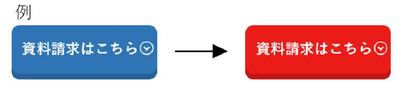
4. Use colors that encourage clicks
The color of the CTA button is a critical factor that shapes the user’s impression.
There has been extensive discussion and research on which color is the most effective, and there are reports that red, orange, blue, and green buttons have improved performance on some sites.
When an improvement effect was observed with the green button, we formed the hypothesis that “because green is associated with the color of traffic lights, it increases the click-through rate.”
Various other experiments have also been conducted to study color, but in fact no universal answer has been found.
However, the psychological impression varies depending on the color of the CTA button, and since this is a factor that can affect the conversion rate, it is important to form a hypothesis and set the CTA button color accordingly.
On that basis, it will be effective to conduct ongoing A/B tests and similar experiments to identify more effective colors.
5. Make it stand out more than the other elements
Some users skim through a page instead of reading it closely, in order to look for the information they want or anything that seems promising.
If the CTA button does not stand out or is hard to understand, there is a risk that users will not notice it. Unless users are aware of the CTA button, they will not take action, so you need to ensure it stands out more than other elements.
For example, using an accent color to make it stand out can help prevent it from being overlooked.
In addition, you can draw attention to the CTA button by placing it in the most prominent area of the page and ensuring it contrasts clearly with the overall page design.
6. Ensure consistency across the entire site
While it is important to make the CTA button stand out more than other elements, maintaining a consistent look and feel across the site is equally important. If you overdo the visual effects in an attempt to highlight the CTA button, it can create a sense of abruptness or an overly promotional impression, which may cause users to become wary.
Ideally, it should blend in with the site design while still allowing users to naturally recognize that there is some appealing content available.
As a general rule for CTA button colors, it is considered best to use a pattern that maintains harmony with the overall site design while still standing out clearly.
7. Make use of photos and illustrations
It is also effective to use photos, illustrations, or icons in CTA buttons. Relying on text alone limits how much information you can convey at once.
On the other hand, photos and illustrations can convey far more information than text.
In addition, because people tend to draw attention, you can naturally guide users to the CTA button by featuring a person who matches your site’s target audience and directing their gaze toward the CTA button.
8. Refining the shape
CTA buttons are generally rectangular, but they do not necessarily have to be. For example, using rounded shapes can convey a fun, friendly impression, which may be effective depending on the concept of the site.
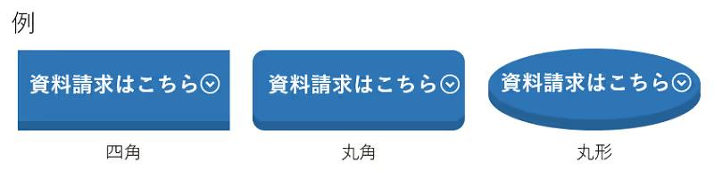
Stylishness, stability, reliability; playfulness, approachability; softness, warmth
Depending on the shape, it may give a mismatched impression, so it is important to choose a shape that fits the characteristics of the service.
9. Indicate that it is a clickable element
Make the CTA button visually prominent so that users can easily recognize it as a clickable element.
Some CTA buttons are designed as part of a page’s images or illustrations, which can make it hard for users to recognize them as clickable elements. If users do not intuitively understand that something is a button, they will not click it.
Therefore, it is important to apply the following measures so that it is easy to recognize as a button.
- Make the colors a gradient
- Use mouse-over effects (visual effects when the cursor is placed over a button)
- Make it look three-dimensional
- Add movement
- Resize
- Add a shadow

10. Optimize the layout
It is important to place CTA buttons with an awareness of how users’ eyes move. On websites in general, people’s gaze tends to move from left to right and from top to bottom in a pattern resembling the letter “Z.”
By placing the CTA button with this flow in mind, you increase the likelihood that it will catch the user’s eye.
For example, one approach is to take into account that the eye moves from left to right and place the main content on the left side of the PC screen and the CTA button on the right side.
There are four main locations where CTA buttons can be placed, and each has a different effect.
Use this as a reference to determine the best places on your website to position CTA buttons.
Top of content
This pattern places the CTA button at the very top of the content.
By positioning it where users first look, you greatly increase the likelihood that they will notice there is an action available, such as requesting materials or registering as a member.
Bottom of content
This pattern places the CTA button at the end of the content.
Because the CTA button appears after explaining the appeal of the product or service, it stands out and tends to achieve a higher click-through rate.
Within the content
This pattern places CTA buttons at various points throughout the content.
It is an effective placement when the site pages are long and some users may not reach the end of the content.
Fix to header or footer
This pattern keeps a CTA button fixed in the content header or footer.
Because it is always visible to users, it can help prevent them from leaving the page.
Examples of ideal CTA buttons
From here, we will introduce three examples of ideal CTA buttons.
Mercari
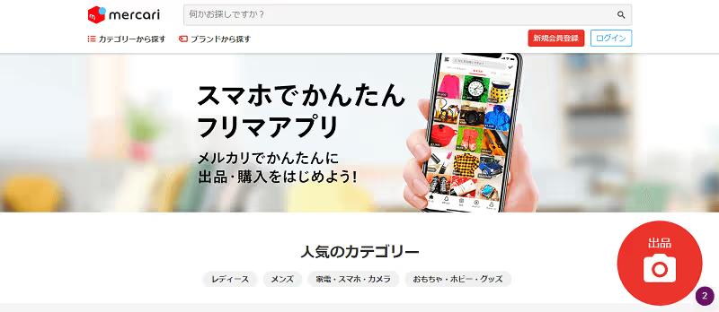
Image source: https://www.mercari.com/jp/
On Mercari’s PC site, a round red CTA button labeled “List an item” is located at the bottom right of the home page, and in the smartphone app, the same round red “List an item” CTA button is located at the bottom right of the “Sell” page.
By using Mercari’s signature red as a bold accent, we successfully created a pop and catchy impression.
By adding a camera icon to the simple label “List item,” it conveys the ease of “just taking a photo,” creating a casual impression and encouraging users to take action.
Apple
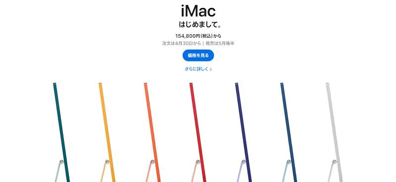
Image source: https://www.apple.com/jp/mac/
On Apple’s product site, alongside striking product photos, there are two pieces of text on a blue background: “Learn more” and “Buy.”
By providing two options, you allow visitors to choose the one they prefer based on how strong their intention to purchase is.
Moreover, instead of using formal terms like “Product Information,” it uses verb-like text such as “Learn More” or “Purchase,” which makes the appeal more intuitive.
Microsoft
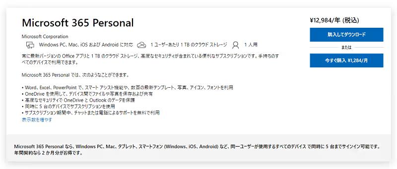
Image source: https://www.microsoft.com/ja-jp/microsoft-365/p/microsoft-365-personal/cfq7ttc0k5bc?activetab=pivot%3aoverviewtab
Microsoft’s product “Microsoft 365 Personal” is a service that allows you to use key Office applications such as Word and Excel for a specified period of time.
There are two plan options: purchasing a one-year license or purchasing on a monthly basis.
By placing two CTA buttons—“¥12,984/year (tax included)” and “Buy now ¥1,284/month”—so that users can see the prices and durations of the two plans at a glance, we can accurately guide them to the plan that best suits their needs.
In addition, a fixed “Contact Us Here” button is placed at the bottom right of the page, allowing users to make an inquiry at any time whenever they have a question.
By making the CTA button rectangular, it conveys a stylish, cool impression and a sense of reliability.
Summary
CTA buttons are a critical element for driving conversions such as product purchases, information requests, and membership registrations.
By not just placing it but also keeping in mind the 10 points introduced in this article and taking inspiration from the design of pages that are already delivering results, you are more likely to achieve better outcomes.
Try running A/B tests with various patterns to identify the most effective CTA button.
To improve form CVR, it is effective to use chat-style forms that reduce the user’s input burden through a conversational format and guide them through to completion.
BOTCHAN EFO reduces the stress caused by traditional long vertical input forms and page transitions, and maximizes your conversion rate (CVR).
Because you can also analyze the drop-off rate for each item, it is possible to improve your metrics efficiently. Please feel free to contact us first.
Learn More
